given that i’m pretty much done painting every piece of furniture in our house, i figured it was time for a house tour! these pix aren’t mine, but were taken by someone who specializes in HDR photography. figured i’d see what results it would produce.
basically, the camera is set up on a tripod, and using a special setting, it takes several images at different exposures. the images are then stitched together through a computer program to create the results you’re seeing here.
interesting.
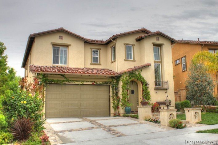
here’s the front of our house. it looks small, but actually, we’ve got 5 bedrooms, an office, a loft and a tandem 2.5 car garage all tucked behind that small facade!
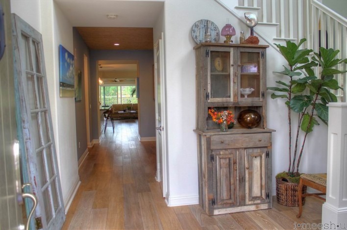
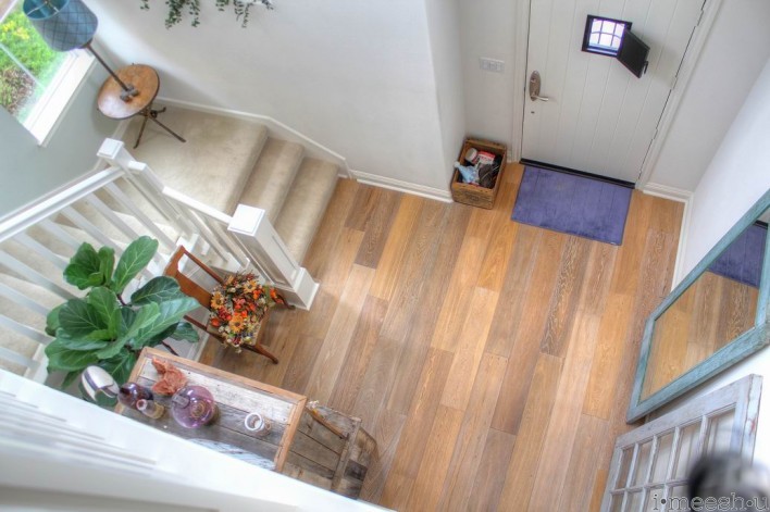
here’s the entry. you can see my very first Craigslist curb alert projects against the wall…the famous french door that has changed my life! the rustic pie rack was a score from the early 90s. and the coffee sack burlap-upholstered chair can be seen here.
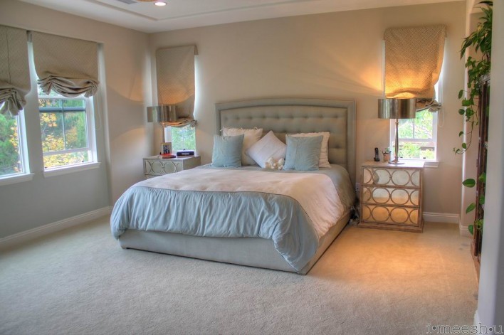
our master bedroom is really the only room that hasn’t been accessorized. isn’t that just how it goes? we’ve got a great view out the back, though, and it is luxurious to wake up to the sound of frogs hiding in a deep fog bank. no neighbors back up to us, but rather, a nature preserve and series of ponds serves as the community’s catch water basin.
i wish i would have spent more time staging and styling rather than gabbing with the photographer. the curtains, the comforter. bleh. all wrinkled and lame. oh well.
the kids do lots of wrestling and taekwon-do in that big space in front of the bed. 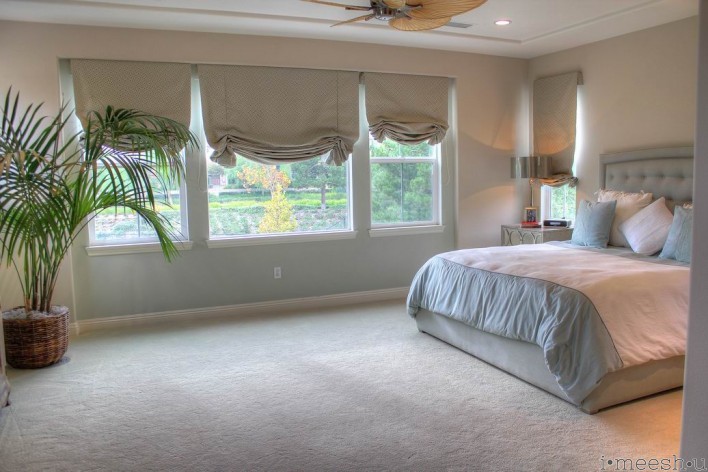
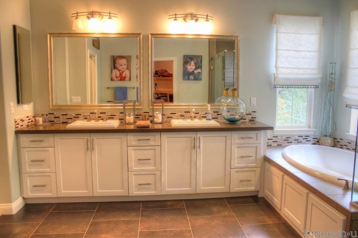
i absolutely love our master bathroom. the counters, flooring, and backsplash are all very masculine, but it works. i negotiated for tassels on the roman shades to bring in a little bit of softness. yay.
the pebbles on the shower floor work perfectly to massage our toes.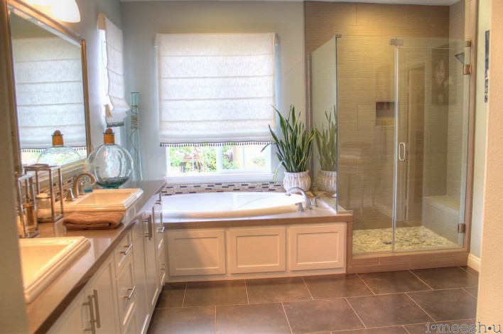
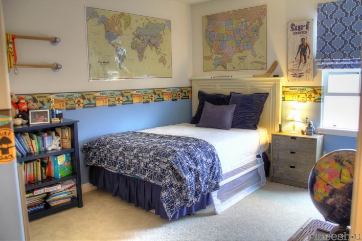
lil G’s room is an eclectic mix of surfer, library, and big boy. he loves maps and reading. the headboard was an Annie Sloan project that i didn’t blog about. the dressers are an Ikea hack. the industrial galvanized steel taekwon-do belt rack is so super cool, but unfortunately is cut off in this shot. you can see it here.
Big A’s room was inspired by a cool Restoration Hardware bed. You can read the painting tutorial here. the dresser is an Ikea Tarva hack, and my second highest trafficked tutorial on my blog! I painted the Craigslist vintage bookshelf in a Benjamin Moore color to match the old Pottery Barn dark blue.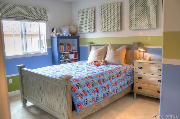
the Jack and Jill bathroom is simple with a stacked subway tile and a glass trim as an inset and above the quartz counter. there’s a cool little pull out drawer at the bottom of the cabinet that i turned into a pull-out step for the kids. we used an industrial drawer slide that holds up to 175 pounds. it works well in this bathroom so that we don’t have to have a step stool that would block the entrance to the tub.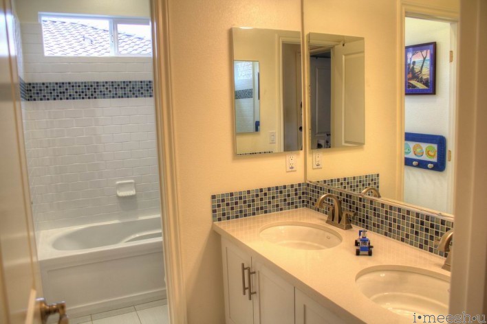
oh, the laundry room. i love this room so much. you can read further on it here.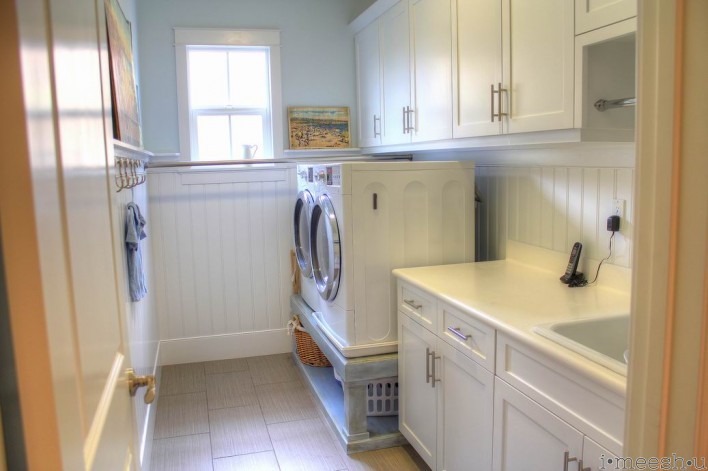
our loft is fun for the boys. what’s not to love about giant lovesacs? and the chess table was a great garage sale find! we still have the train table in there which takes up a ton of room, but such is life when you’ve got boys. you can’t lose the train table…b/c then it turns into a Lego table, right?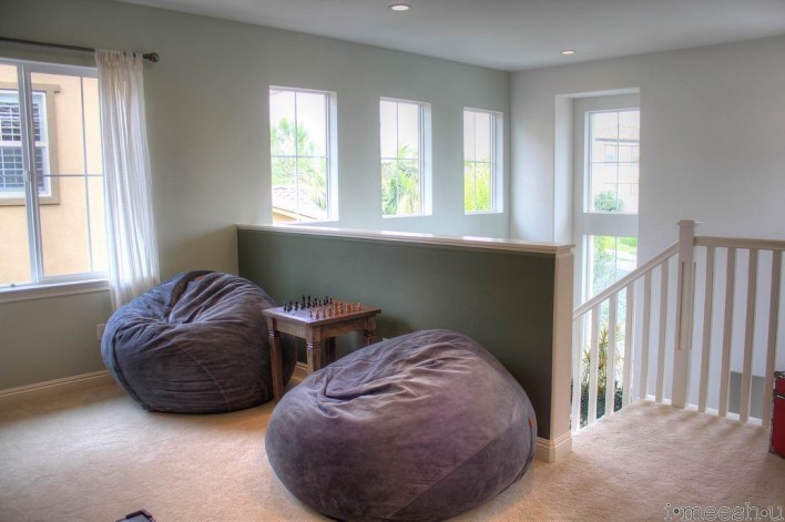
here’s a shot to our front entry. we love the floors, which are Provenza engineered wood. they’ve been extremely durable, with the boys riding their bikes on them for the past two years.
the kitchen was really the selling point for us on this home. it’s a huge room connected to our dining area and the great room. the kids can (and do) sprint from the front door to the back of the house for hours, all while i’m prepping dinner. the backsplash is easy to maintain. i still really love our dark quartz counters. so easy to keep clean, no wine stains (ever), and is a nice contrast with the white cabinets. the tutorial for the kids’ dining table is found here.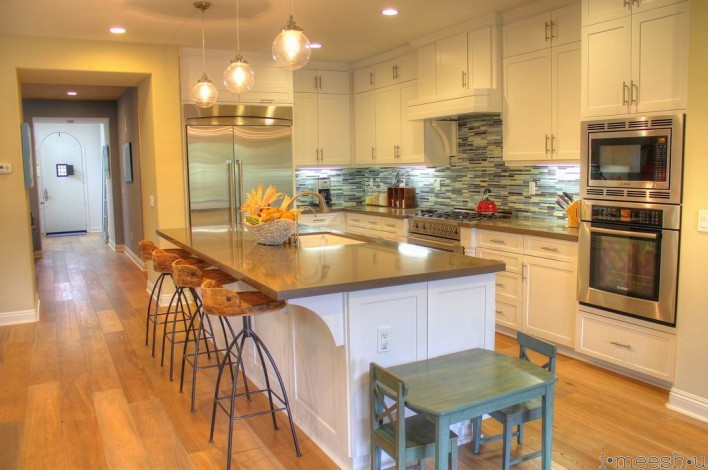
the pendant lights and barstools are by the same designer, but the name escapes me right now. lemme know if you’re interested and i’ll dig it up.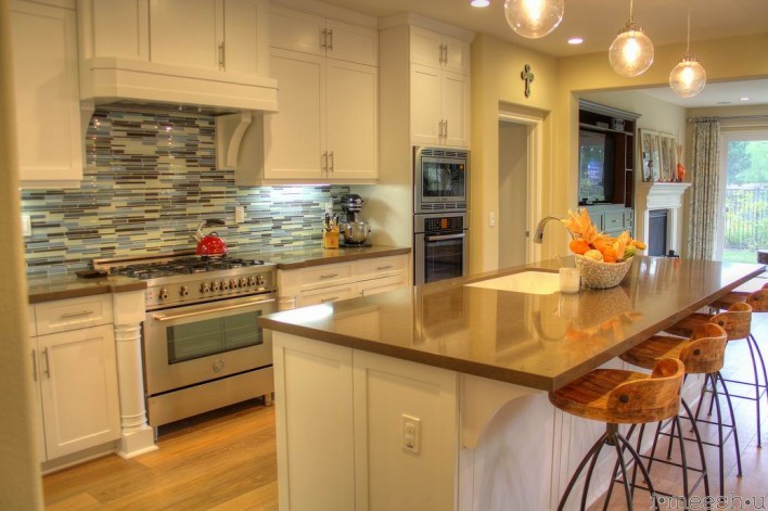
and there’s old trusty zero to hero coffee table. it was one of my earliest Annie Sloan painting projects and it’s held up incredibly well. the boys play HOURS of Hot Wheels and Legos on this table and it still looks great.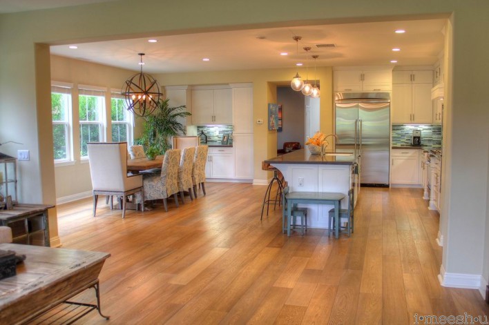
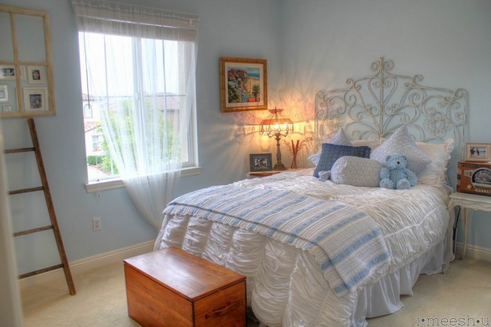
here’s the one girly room in the entire house. i dyed the pillow fabrics and made the pillow cases. the duvet is Anthropologie and the blue and white throw blanket is Ralph Lauren. the French side table tutorial is here.
This is our office with custom build-ins that I designed. My friend Andrew did all the faux finished painting. He’s incredibly talented…and NEVER uses a drop cloth or masking tape. WHAT???
My mother-in-law painted the painting in the center and to the right. She’s incredibly talented. 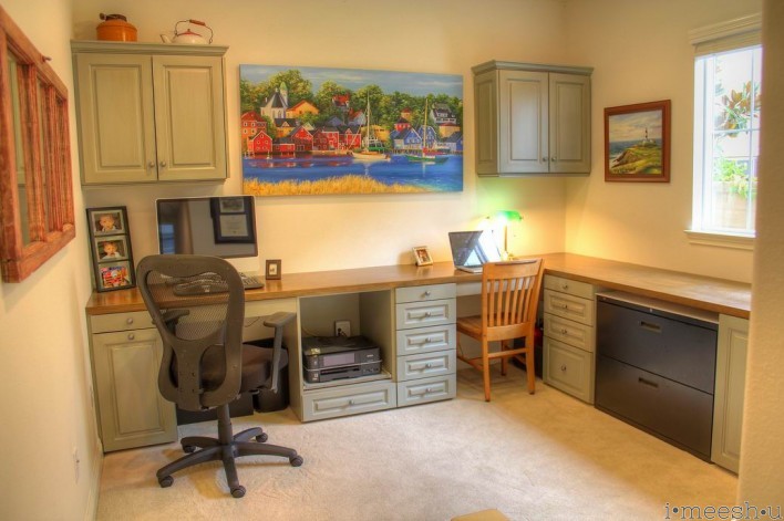
Andrew also faux painted our custom entertainment center built-in. I want to paint our fireplace, but am not sure what to do. The huge clock on the wall is Pier 1, but the hour arm has been busted for months. It’s perpetually some time between 6 and 6:30. 🙂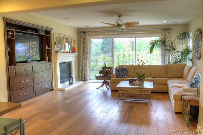
we spend a ton of time at this oversized dining table. most meals and many hours of Legos are enjoyed here. the table arrived unfinished and unsealed. that’s my next big project….sand and finish with Modern Masters’ Dead Flat varnish.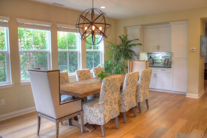
this room was originally designed as a dining room by the builder, but with such a gigantic morning room, it didn’t make sense for us to have two dining areas. so, it’s now the music room. the pseudo subway windows are of my hubby’s favorite surf spots. the ever cool wine barrel book shelf tutorial is here.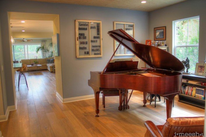
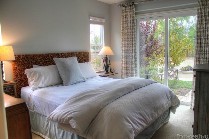
this is our 5th bedroom which is a downstairs suite leading to our backyard. it’s perfect for our parents who visit often. you can see a teeny glimpse of the queen anne dresser i refinished.
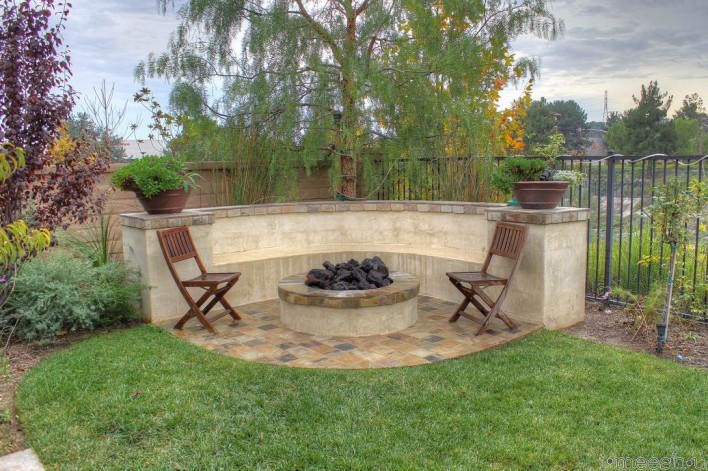
this fire pit is pretty cool for roasting marshmallows and hot dogs. i designed the seating to have a ledge deep enough behind the seats for people to place drinks and food, and sit if the fire gets too hot.
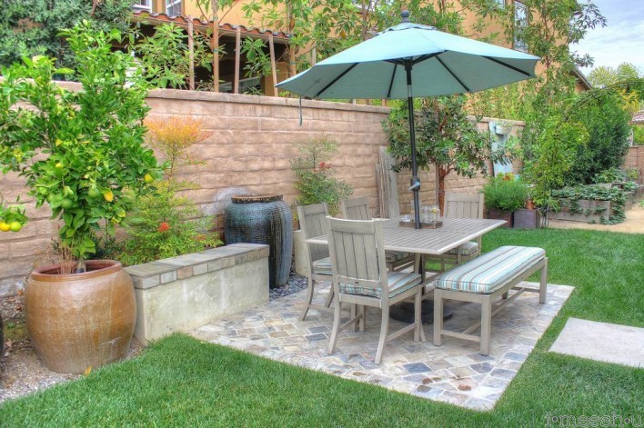
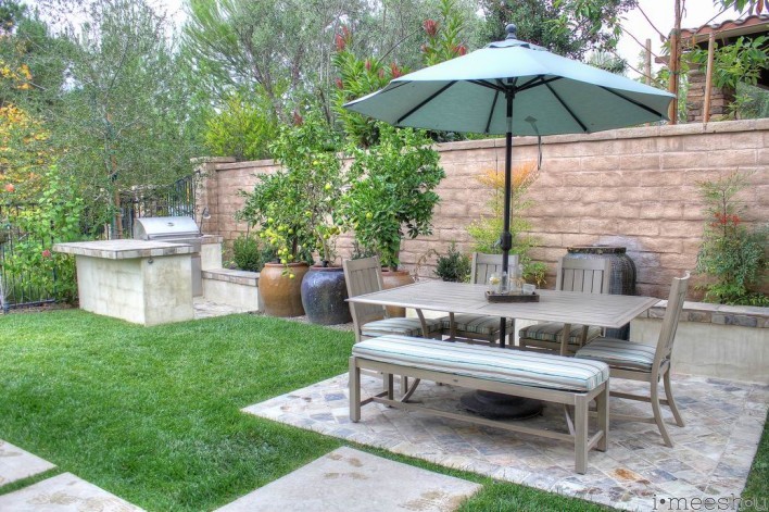
this cool dining table is an aluminum made to look like wood. it’s super light and very easy to clean. we eat out here a lot during warm nights. it was particularly great when Big A was learning how to eat rice and millions of rice grains would scatter in the grass. 🙂 just beyond the table is my raised planter garden.
tomatoes, cucumbers, fresh herbs, potatoes, spinach, peas, eggplant, artichokes. it’s all back there. and to the left of this pic, you’ll see citrus in the blue container. that’s called a fruit salad, which kicks out three different types of fruit: limes, lemons, and oranges. they’re all grafted together. eventually, one species will take over, but for now, we get all 3 fruit and it’s fun!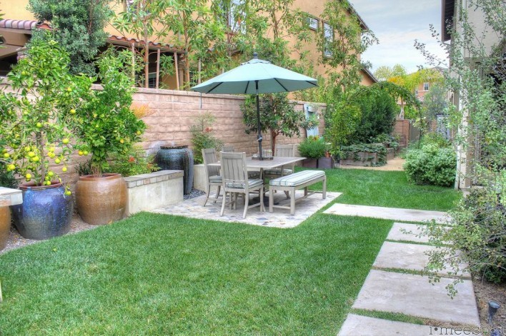
finally, you see the BBQ. i cook out here all the time, even during winter. it’s so easy and peaceful. under the counter is a niche built for a trash can. and just under the counter i added a vintage coca-cola bottle opener for when guests need a place to crack open a beer.
hope you’ve enjoyed the tour!
What a beautiful home. Nice work, Meesh!
Thanks, Selina! 🙂 Miss you!
“it looks small, but actually, we’ve got 5 bedrooms, an office, a loft and a tandem 2.5 car garage all tucked behind that small facade!” — small?!?! Maybe it is all relative depending on where you grew up, where you live now, and where you expect to be, but to a NYC guy who grew up lower middle class in the NYC suburbs, went to Harvard, and is now finally (in his 40s) knocking on the bottom of upper middle class (still in NYC suburbs), that house looks pretty darned big and fancy! The inside pics are nice, too; you have very good taste. But small, not. Oh, and get that clock fixed. I wish I could see it better, but it looks beautiful.
Hi there, what an amazing job!
I was wondering where you got your master bedrooms nightstands and the lamps? And I would love to know the brand for the barstools in the kitchen. Way too cool!
Thanks.
Hi Lily, the bar stools are Henson Counter stools, but here’s a warning…they’re too high! So be sure to order them to fit your counter. We’ve since moved and they’re too high for a 36″ counter unless you’ve got tiny skinny legs. Friends still sit here, but they do feel a bit awkward being to high up! We’ve even looked into getting the metal cut down, but alas, the metal shops are reticent to touch them…. 🙁
http://www.blisshomeanddesign.com/FURNITURE/Bar-Furniture/Henson-Counter-Stool.html?gclid=CjwKEAjwx9KpBRCAiZ_tgYKWvhQSJABQjGW-nQOu00hjTP-RUtc_lpkJDjpADnnkgM2UR53tUs447RoCT8nw_wcB
I don’t recall where the night stands are from. Sorry.